Do you want to know how to include the Doughnet Chart in a React JS application and customise the tooltip message? Let’s go over the steps.
Step 1: Create the react application
npx create-react-app doughnet-custom-tooltip
Test the application running status
cd doughnet-custom-tooltip
npm start
This will launch your browser and start the application at localhost:3000.

Step 2: Install the required packages
In this demo application, we will use the react-chartjs-2 Doughnet chart component. As a result, we must use the following command to install the necessary packages.
npm i react-chartjs-2 chart.jsreact-chartjs-2 is a React wrapper for Chart.js with a variety of appealing chart components.
The chart.js library is required for the react-chartjs-2 library to function.
Step 3: Render the Doughnet Chart
Modify the App.js page by including the Doughnet chart component with the necessary data and options.
Initialize the Data and Options (settings for chart)
const data = {
  labels: [
    "Submitted",
    "Approved",
    "Pending",
    "Inprogress",
    "Acknowledged",
    "Shipped"
  ],
  datasets: [
    {
      data: [25, 15, 30, 15, 10, 5],
      backgroundColor: [
        "#336699",
        "#99CCFF",
        "#999933",
        "#666699",
        "#CC9933",
        "#006666"
      ],
      borderWidth: 2
    }
  ]
};

const options = {
  cutout: "80%",
  plugins: {
    title: {
      display: true,
      text: "Order Status",
      fontSize: 10
    },
    legend: {
      display: true,
      position: "right"
    }
  }
};
Rendering the Doughnet Chart
<div className="App">
    <Doughnut data={data} options={options} />
</div>
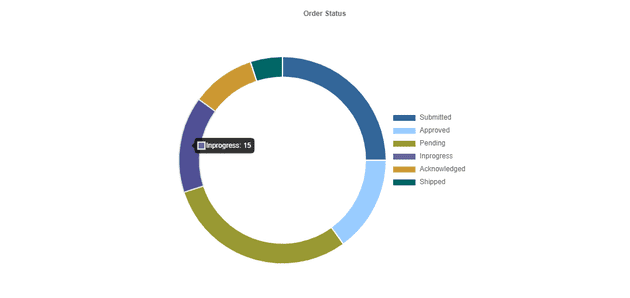
The data property stores the chart data’s details such as label text and the background color of the chart bar.
The options property stores information about chart settings such as legend display, position, and title display.
Adding styles
#root {
  display: flex;
  justify-content: center;
  align-items: center;
  height: 100vh;
}

.App {
  height: 500px;
  width: 500px;
}
#root - Styles for centering the chart on the page.
.App - Styles for configuring the height and width of the chart container element to display in a specific size rather than the default size.

Tooltip Customization
  const options = {
      ...
      ...
      tooltip: {
        callbacks: {
            label: function (context) {
              let label = context.label || "";
              const data = context.dataset.data;
              const parsedValue = context.parsed;
              const total = data.reduce((a, b) => a + b, 0);
              const percentage = ((parsedValue / total) * 100).toFixed(2);
              if (percentage) {
                  label += ` : Count: ${parsedValue}, Percentage: ${percentage}%`;
              }
              return label;
            }
        }
      }
} 
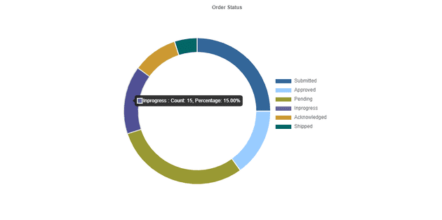
- callbacks - This tooltip callbacks method will be called before opening the tooltip message for each bar. As a result, the customising message returned by this method will be displayed in the tooltip.
The above code snippet can be found in the following codesandbox location as a working example.